


Don’t you think most men tends to stick with the basic colours, the colours that they know will work and safe for everyone? It’s either black and white or the neutral colours. Sometime I wish men are braver with colours as brave as they are with new challenges!
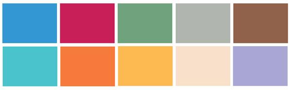
When I saw the colour chart that Pantone came up with for Spring, it makes me think which men really wore these colours? I would really love to meet them, and ask them what are their recipe for defeating the colour scare? Let’s see what colours are out there for next spring. Basically, the colours still revolve around the theme ‘escapism’ where some favourite colours from previous season are still being retained. Designers were inspired by hues often seen in Africa, India, Peru and Turkey.

1st row: Regatta, Barberry, Turf Green, Flint Gray, Russet
2nd row: Blue Curacao, Firecracker, Beeswax, Linen, Lavender
Regarding the spring colours selection Leatrice Eiseman, the Executive Director of the Pantone Color Insistute commented, “This time, everything is a little more exotic. It really has to do with everything that is happening in the world. There is still a lot of concern about the economy and life in general. It is very natural that designers would have those things in their thought process as they choose their colors.”


Michael Kors & Tommy Hilfiger
On the top of the colour chart where most designer used it is Regatta and Tommy Hilfiger is a huge fan of this shade. This colour is not the same as your ordinary navy blue, it has more energy and vibrancy in it. Perfect for spring but still remain on the safe level as a men colour, since blue is always associated with boys.
Barberry comes second, surprisingly even though it’s a pretty strong colour but for spring more than 15% of the men collection are using this colour. It looks very deep, somehow sexy and daring. But don’t you think it will actually suit most men if they’re just willing to come out from their comfort zone?


Tommy Hilfiger & Nautica
Where the women are loving the army green, then then the men goes for Turf Green. Green is not something new for men’s collection, but this shade of green goes a little bit lighter but still depicts images such as green grass on the athletic fields or golf courses.
 Other colours you see on the spring men’s collection are the variation from safe and vibrant. The safe one include Flint Gray who you could not miss because it’s a staple colour especially when it comes to suit and Russet, the type of neutral brown but deeper where you expect to see more on fall. If your men never really care about seasonal colours and tend to have colour to stick all year round then russet would be the perfect choice.
For the more interesting one we’ve got Blue Curacao (leaning toward turqoise), Firecracker (bright orange) and Beeswax (warm yellow). Where there are two colours that intriqued me they are Linen because it’s a neutral light shade but inclining more toward pink and Lavender. Most men found these two colours to be too feminine but they’re actually perfect to be worn under a dark suit such as grey and black.
Now that you know the colour selection from Pantone for Spring Men’s Collection we would love to know if you could choose any colour to be worn by your man, what would it be?
*Source & Photos from WWD
